Cozy and Delicate - branding for AmorVerde, Casa nella Natura
- Alessia Guarnieri

- Jan 17, 2024
- 3 min read
Updated: Jan 22, 2025
in Rain Forest, Shamrock, Caramel Cafe, and Winter White
Casa AmorVerde is part of a farmhouse immersed in nature.
It is a project born from the desire to create a space for anyone looking to rediscover themselves, dedicate themselves to personal growth, and reconnect with nature.
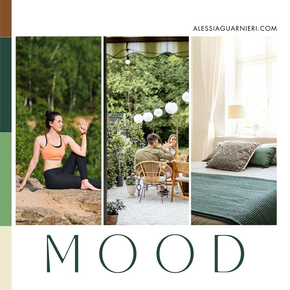
The cozy and delicate palette of AmorVerde is inspired by the tranquility of the surrounding nature and the connection with Nature. The colors blend harmoniously, precisely because they aim to create a warm and rejuvenating feeling.
Rain Forest: a deep and lush green, inspired by the lush vegetation. It represents regeneration and vitality, conveying harmony with nature that characterizes the AmorVerde space.
Shamrock: symbolizes the connection with nature and spiritual growth. Shamrock represents freshness, rebirth, and the vitality of nature, creating a refreshing and encouraging atmosphere.
Caramel Cafe: this caramel shade evokes a sense of welcome and warmth, reflecting the family atmosphere. Caramel Cafe conveys reassuring and enveloping energy, inviting guests to feel at home.
Winter White: a pure and delicate white, symbolizes peace and purity. This shade conveys a sense of tranquility and harmony, reflecting the essence of AmorVerde as a place of peace and healing.
Logo Design
The logo, a heart with simple lines ending with a leaf in the center, symbolizes love and connection with nature. The heart represents hospitality, while the leaf indicates growth and rebirth.
The fonts used are:
Tan Mon Cheri, elegant and romantic, with distinctive and graceful traits. Its lightness and fluidity add a touch of sophistication and femininity. Its sinuous shapes capture the essence of delicacy and connection with nature, making it an ideal complement to the brand.
Evolventa, a modern and stylized font that adds a touch of originality and contemporaneity to the brand. Characterized by distinctive features and fluid lines, it reflects the dynamic and ever-evolving nature of AmorVerde.
Every visual element has been carefully selected to convey a sense of calm, serenity, and (re)birth.


AmorVerde was born from the passion to create a space immersed in nature, where individuals can rediscover themselves, dedicate themselves to personal growth, and reconnect with the regenerating energy of Mother Nature. The vision is to offer a versatile place for cultural, recreational, educational, and healing events, where every visitor feels loved and welcomed
The multifunctional structure allows the hosting of diverse events such as seminars, workshops, courses, recreational activities, and retreats. Moreover, it is a place dedicated to healing and self-discovery, offering a space for holistic practitioners to perform treatments in an intimate and tranquil environment.
After the branding work with AG Studio, AmorVerde got a visual identity that accurately reflects its mission to be a welcoming retreat in nature.
The chosen color palette, logo, and fonts convey an atmosphere of delicacy, coziness, and connection with nature. The result is a distinctive and consistent brand that has made AmorVerde easily recognizable, contributing to its success as a destination for personal growth and well-being in nature.
Are you ready to launch a new business or enhance your current brand/website?
AG Studio guides bold entrepreneurs in the hospitality and personal development industry with personal and/or business brands to conscious growth and sustainable success, helping them stand out online.
CLICK HERE to learn more about my services and how I can help you!


